JYSK rethinks the store design
Date:
Author: Laura Sulbæk Frederiksen, Communications & Sponsorship Consultant
Category: Attractive Stores
The design and expression of JYSK’s store concept have been rethought and updated in a new, big project under the name “Future Store Concept”.
Blue carpets, cold white walls and lots of campaign signs, fighting for the customers’ attention.
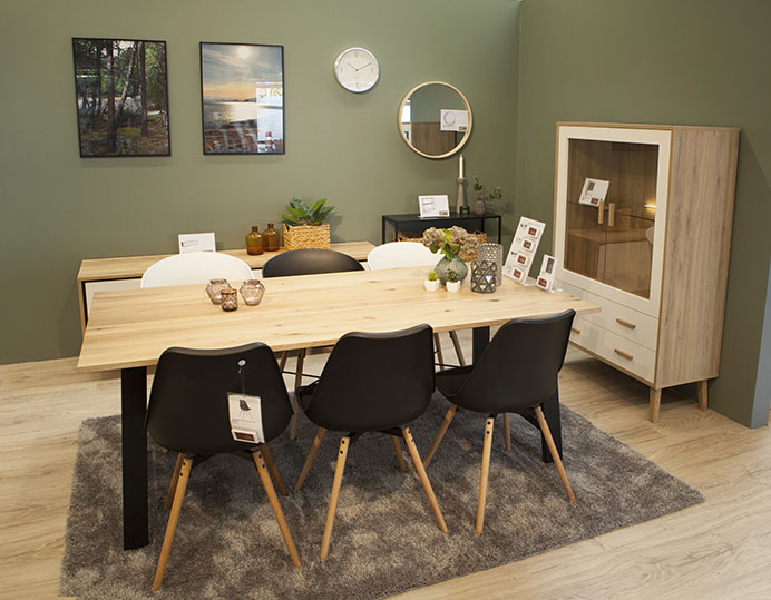
That is just some of the elements, which will change in JYSK’s updated store concept, which the Retail Development department together with Marketing has been working intensively on, and which is now ready to be rolled out to the first stores.
“The project is about updating the store concept and bringing the expression into 2017. The current store concept is originally from 2001 and has been expanded through the years. So every time new products have arrived, we have had to find new solutions, so in the end the concept has been filled with quick fixes, which have not been thought through as a whole from the beginning,” says Michael Lauritzen, Retail Designer at JYSK, who has been one of the front runners of the project.
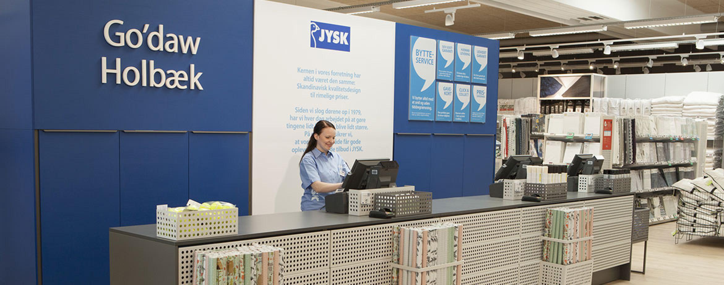
The first store designed according to the new store concept opened on September 15th in the city of Holbæk in Denmark. In October, two more stores with the new store design will open in the city of Gothenburg in Sweden and Gdansk in Poland.
More room for inspiration
Therefore coherence has been one of the keywords from the beginning of the project, where there was also a big focus on optimising the space for each category of products. The new concept provides more space for both decoration and inspiration.
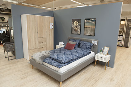 “In the new concept there will be more room, for instance, in the furniture section, which will give better possibilities to decorate the interior and inspire the customers. Hopefully that will provide a homely atmosphere instead of a stock room feeling – regarding both furniture and smaller product groups,” says Michael.
One of the most obvious changes in the new concept is the light wooden floor, which replaces the former dark blue carpet. But all parts of the concept have undergone a thorough renovation – from lighting, colours on the walls, signing and fixture.
New blue colour in use
To the marketing department, who have had the job of creating all the visual elements for the concept, coherence and calmness have been central themes.
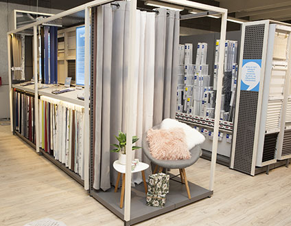 “Visually it will be very different in the stores, and we have tried to do the marketing in a completely new way. One of the big changes is that we have started using a new colour, which is lighter than our “JYSK blue”. I think that it will give the biggest boost and create a good coherence in the store, which in the end will lead to a better overall impression,” says Marc Nicholas Bech Fruergaard, Brand Manager at JYSK.
In the spring of 2018, an additional 15 to 20 stores in Denmark, Sweden and Poland will open with the new store concept. Then JYSK will evaluate when and where the concept could be rolled out in the future.
What do the changes mean to the colleagues in the stores?
“They will get some slightly different solutions, but most of the operational things that need to be done will remain the same. As an example, there will be a bigger amount of end walls for decoration, but it will of course be described in the concept how they need to be decorated. So of course our store colleagues will experience a bit of adjustment to their work.”
- Michael Lauritzen, Retail Designer at JYSK.


