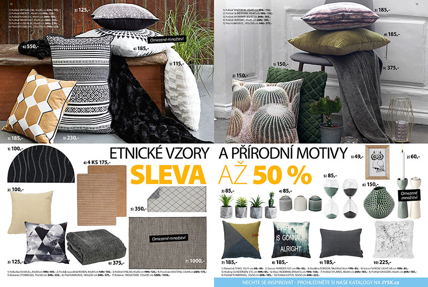
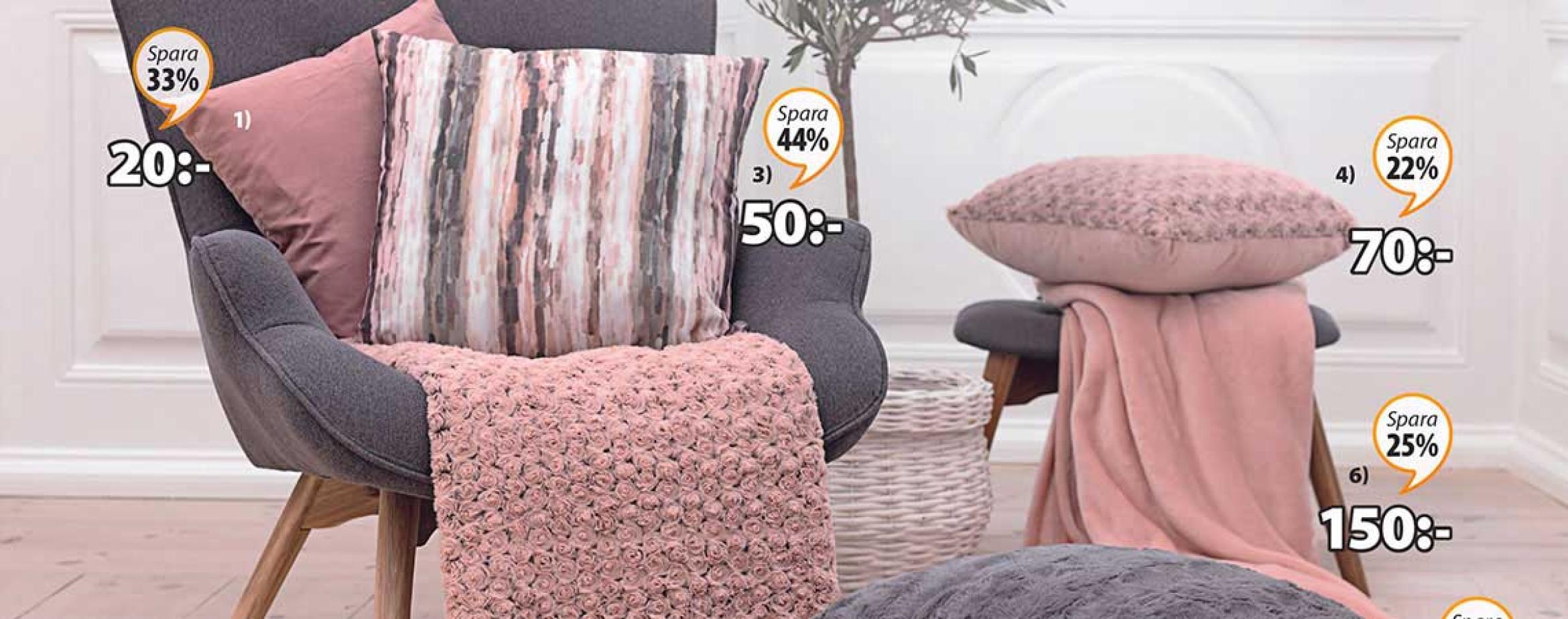
Campaign papers are filled with environmental photos
Date:
Author: Laura Roesgaard, Sustainability Communications Consultant , JYSK
Category: Product Assortment
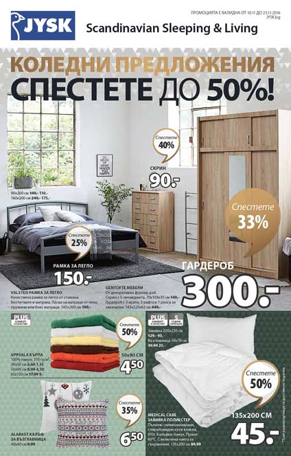 More environmental photos will enhance the quality of the products and inspire customers.
Have you noticed that our campaign papers have a new look? More environmental photos are being used – where products are showcased as part of a realistic environment – and the paper is less divided.
“We have, among other things, removed boxes to make the photos larger. Instead of placing the headline in a box of its own, we are now writing it across the top of the photo. That gives the paper a more magazine-like expression,” says Marc Bech Fruergaard, Brand Manager.
Inspiration as keyword
We are more focused on inspiration than we used to be, explains Sales Manager Helle Møller Pedersen, who selects products and photos for campaign papers.
“The photos are more important now – as a rule we need a nice picture before we choose to display a product prominently in the paper. With the environmental photos, it is also easier to let the products ‘speak to each other’. We are focusing more on forming a whole, and that makes the paper less boxy and more inspiring,” she says.
Why this change?
A photo says more than a thousand words, which is why it is better to show that JYSK is “Scandinavian Sleeping and Living” instead of saying so. The new style shows customers how to use the products in their decorating, explains Marc and adds:
“The quality is also better showcased if the products are presented in inspiring environments – and improving quality perception is still a part of JYSK’s strategy.”
